 My fellow creative-industry Apple users: prepare thyselves. Heresy lies ahead. You may not like what I have to say. You may think I'm batty. That's fine. For myself, I'm at the end of a months-long quest for a more flexible workflow, and I'm having quite a bit of fun. It was a bumpy road getting here, but for me, moving my digital art production from a giant Cintiq to the Surface Pro was the right move. If you have a similar desire to break your desk-bound chains and put on the shackles of forever having your work with you, read on. We can share the crazy.

What I wanted: a truly portable Cintiq replacement with good ergonomics (boo to you, tablet PC), a full OS (boo to you, Samsung Note) and enough horsepower to run professional software with ease (boo to most of the rest of you). Tablet PCs (as opposed to slate PCs/hybrids/whathaveyous) have been around for ages, and initially, I tried one of the latest and greatest, the Fujitsu T902.

It had tons of power (16 GB of RAM) and the standard Wacom digitizer, but it proved problematic for several reasons. Its hardware was awkward and difficult to hold (for me), its drivers were frustratingly glitchy, and its screen was lackluster. On paper, its hardware specs meant that all my software would run well, so I really wanted to like it. In the end, it just wasn't the right fit, so I returned it and continued the hunt.
I was initially turned off from the Surface Pro for its smaller screen and RAM limit of 4 GB. Photoshop users who work on large color files know the importance of RAM. Illustrating for print, 4 GB is adequate, but 8GB can make a dramatic difference. To that end, I started looking at a new Thinkpad called the Helix that's very similar to the Surface Pro, with some nice perks. It has a larger screen, double the pen sensitivity, better battery life, better keyboard, and the option for 8GB of RAM. Unfortunately, it was supposed to come out in January, but missed its ship date several times over, and as of now, it's still not widely available. After purchasing that T902, I sold my Cintiq, because I play it fast and loose like that. After returning the T902, I was without a digital art tool. You may ask why someone who makes their living with digital art tools would put themselves in such a position. To you, I say, in a child of Bill Cosby voice, "I-DOH-NOH!"

There's been a lot of mixed press around the Surface, and a whole bunch of Apple users (I've been one for years) will forever be set against anything non-Apple. For them, the closest option in this category is the Modbook Pro, but it lacks a keyboard, has a non-touch optimized OS, and is ridiculously expensive. Like, three times the price of a Surface Pro expensive.
Back to the Surface, there's also the concern for digital artists that several months after its release, it still lacks a pressure-sensitive driver for WinTab coded software. All this gobbledygook means is that the Adobe Creative Suite, Painter, and other major creative applications lack pressure support (imagines self as Microsoft engineer and smacks head). Usually, you can just download a Wacom driver and apply it to a system like this, but in this case, Microsoft monkeyed with the Wacom hardware/software and made it proprietary, meaning, no driver for you. Yikes. Another annoying issue in trying to run the Creative Suite on the Surface: you can't hold and click the tool bars to access sub-tools with the pen. It's some kind of problem with the driver not registering a click-and-hold in Adobe software. Beats me. At any rate, those are big points against the Surface. Will these problems be fixed? Microsoft tells me so, but it was almost enough to get me off the boat, until I made an important discovery called Manga Studio 5. More on that later.

So what does the Surface Pro get right? I like the shape of it, I like the portability, I like the quality of the screen, in spite of its high resolution making some interface elements tiny. Bifocal users, beware. Ironically, one of its best qualities for my use-case is something Microsoft never intended - laying the screen and keyboard flat so I can work on an inclined surface, like a drafting table, and have access to keyboard shortcuts. One of the things I disliked about my Cintiq was the clunky nature of using a keyboard for shortcuts when that big screen was taking up so much desk space. Wacom tries to fix this by giving you programmable buttons on the Cintiq itself, but somehow those are never enough for me. I guess I use mad keyboard shortcuts. With the Surface, my keyboard shortcuts are directly under that little screen in a very convenient place. It works well for me, especially after I built a little custom lapboard, which supports the keyboard in a solid way and holds everything in place. This way I can use the machine on my desk or on my lap equally well.

Right now, people are either shaking their heads in disbelief or nodding them with nerdly DIY approval. Again, I'm having fun, and it actually works. I can pack the little lapboard in my backpack with the Surface, and head to my studio, or a client's office, and go to work with naught more than a chair. Just a couple days ago I worked on contract for a local design firm and did 100 storyboards in seven hours with this setup.
But what about the Creative Suite, and all that driver brokenness?
Soon after I picked up the Surface, I faced that problem. I had a job I needed to do, and no functional Creative Suite with which to do it. I went looking for a temporary solution. It turns out that some very good software does support Microsoft's drivers, including Sketchbook Pro and Manga Studio. I'd never given Manga Studio a chance, because I was so used to Photoshop and got turned off by the clunky interface of older versions. People lauded it, but I was too stubborn and set in my ways. I knew Photoshop wasn't a good replacement for drawing with pen and paper, so I didn't expect Manga Studio to be much better. I figured Wacom hardware was the main limit between what I could get from traditional media and what I could get from digital. With digital tools, I've been used to getting maybe 50% of the control and finesse I can achieve with good old pencils and brushes on paper- that's with the pro-grade Cintiq. It's fine for coloring, edits, and quick and dirty jobs like storyboarding, but from what I'd experienced, it couldn't hold its own against pencils and paper.
Manga Studio changed that for me in a big way.

With its latest version (5), Manga Studio has a fancy-pantsy new brush engine. What was already markedly better than Photoshop became hugely better with this latest release. I can now get results that are 90-95% of what I'd expect to get with traditional media, and that's just the brush engine. There's also superior capabilities in terms of layout, coloring, and perspective tools. I came to my studio as an evangelist, and immediately got 15 colleagues to make the leap with me. So far, everyone's digging it, and thanks to the new version's UI being similar to Photoshop's, the transition hasn't been difficult.
They aren't even paying me to say this, but listen: If you're an illustrator and haven't given Manga Studio 5 a shot, please do. I think you'll be pleased. The current Debut version lacks a few of the capabilities of their previous EX version, but an update's coming this summer that adds those features back in. In the meantime, you have a fantastic piece of software that has all the brush-creation, actions, CMYK color space, and tools you never thought of, for like, so little money it's hard to take seriously. Try it.

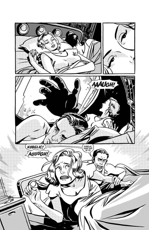
I made the switch to doing all my comics pencils in Manga Studio on the Surface with Batman '66, which I'm leading off for DC. Likewise, an Eerie short story for Dark Horse. This is an example of my Manga Studio blue-line art, and it's really indistinguishable from my traditional pencils. I can then print it out on our large format printer and ink it traditionally. That way I don't have to spend my whole life in front of a screen, and I have original art to sell if I choose to do that (and choose to do that, I will).

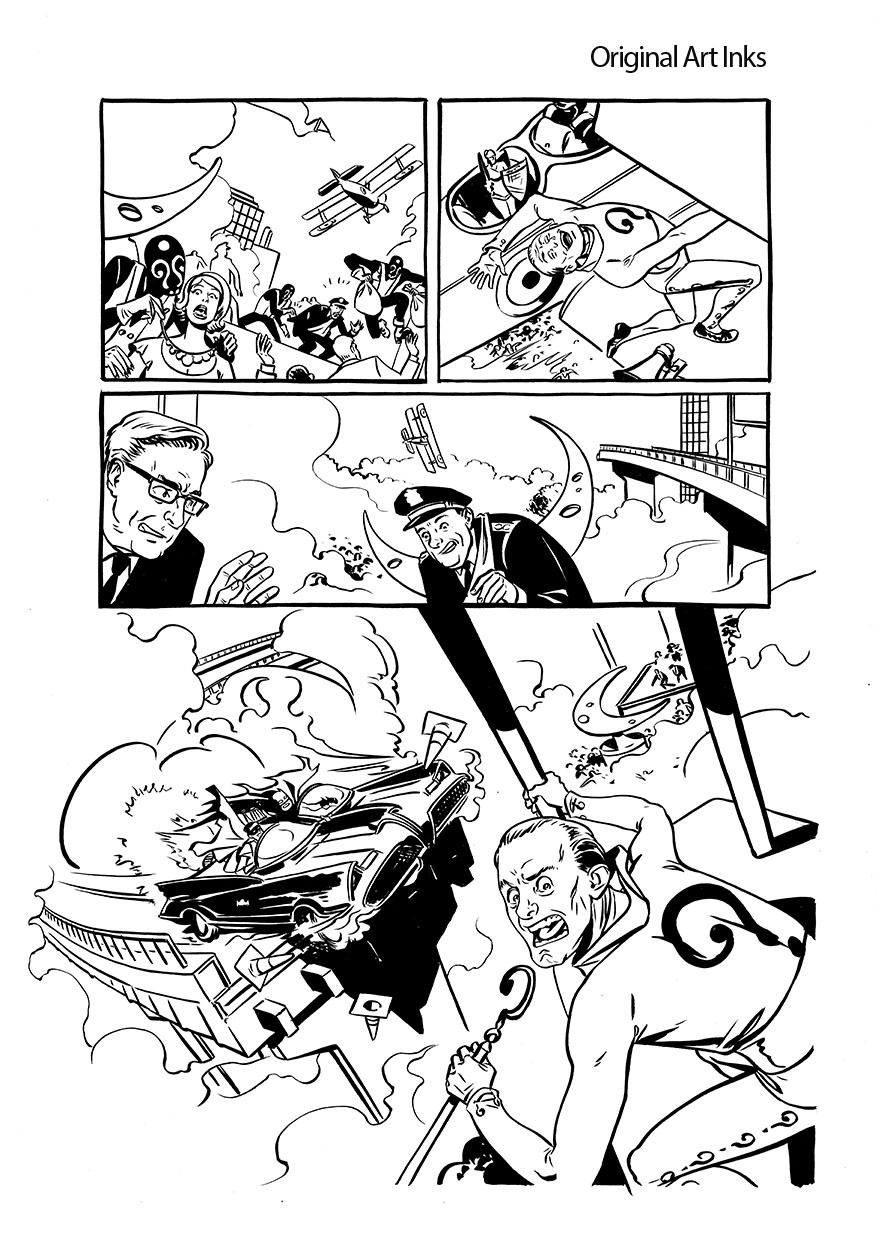
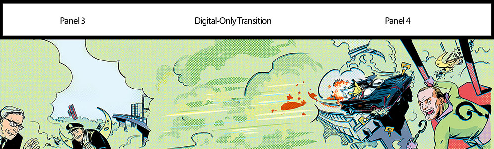
But even if I didn't want to do inks traditionally, it's possible to get really good inking results on the Surface with Manga Studio. Here's an example of our launch art. After they had me execute this (pencils in Manga Studio, then inked traditionally), DC came back and requested I expand all the characters to full figures. I was able to bring the original art into Manga Studio (I'd already colored it there) and expand each figure and their colors with seamless results.

I've even started playing with digital painting, which I haven't done before, using the Surface/Manga Studio combo, and I'm really digging the results. It makes me want to get out my oil paints, and that's about as high a compliment as I can pay a digital tool (I've kept those paints in a box since college).
By the way, when you get Manga Studio, as you will, be sure to check out Ray Frenden's MS5 brush set. I'm using it daily, and it's fabulous.
So that's my journey so far. There seems to be a lot more on the horizon in terms of these portable solutions, so things will only get better. For the sake of artists who will never leave the Apple ecosystem, it would be great if Cupertino tried their hand at something like this, but Steve Jobs once said, "if they include a stylus, they've failed", so that's probably not gonna happen. Even so, if you're well heeled enough to have two Cintiq-like devices, one for your office, and one for the road, I'd recommend something along the lines of the Surface.
Or just be crazy like me. Bite the bullet and make this your sole computer/art tablet/etc. It's scary, but it's also the first time that upgrading to a new system actually made me money, since I sold my Cintiq and Macbook for much more than the Surface cost (and they were both four years old).
And now I can run free as bird, unchained by the... oh, yeah. Work's with me everywhere now.
Back to it!
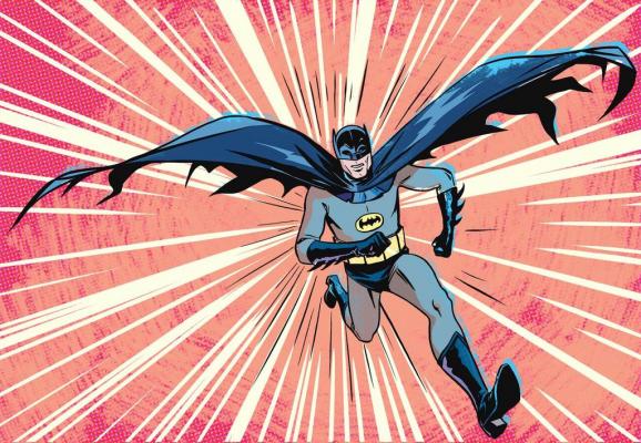
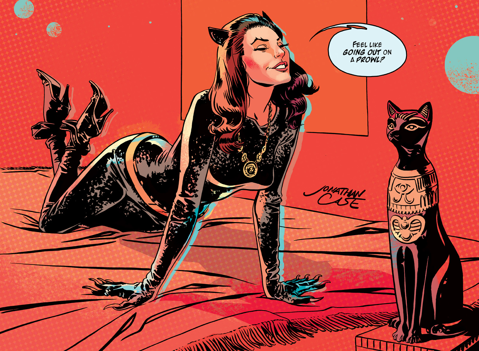
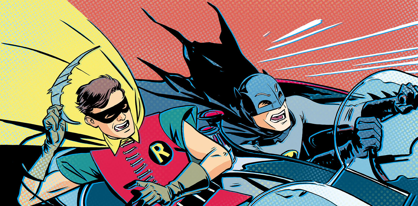 It's BAT WEEK, boys and girls! Batman '66 #1 (part 1 of 3) goes on sale in a digital enhanced edition this Wednesday, and to make with the pomp and circumstance, the NY Post is running a series of articles and blog posts detailing the project. Today, there's an
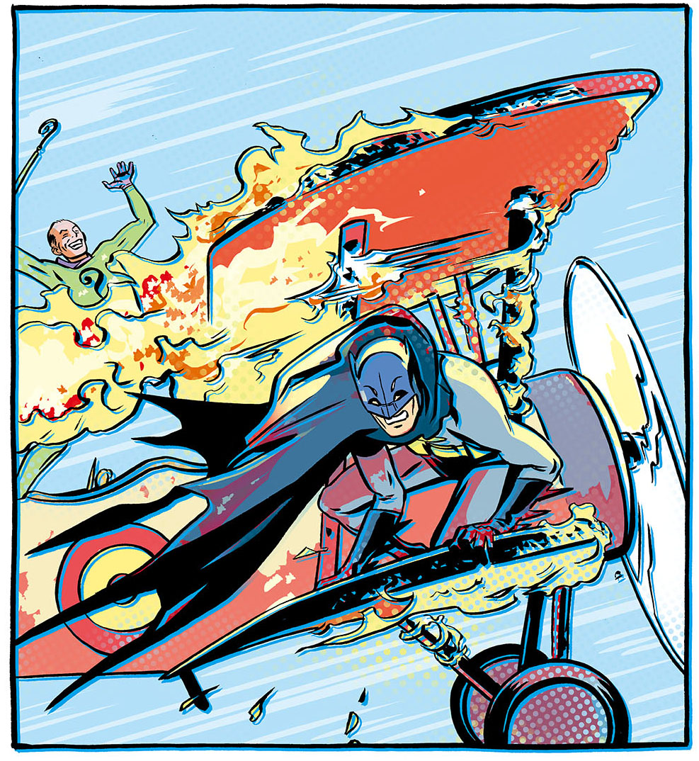
 They did it! After three months of no pen-pressure support in programs like Adobe Photoshop, Painter, and Paint Tool SAI, Microsoft and Wacom have worked out a driver for the Surface Pro that fixes it all. Head over here to snag it:


 Look at that! A
  Firestorm, 10x15 ink and watercolor wash, single figure, $120.


 Photo credited to
 Happy Fourth of July, America. To celebrate our independence from those tyrants across the pond, I'm showing off my favorite non-English European cartoonist.
His name is
Happy Fourth of July, America. To celebrate our independence from those tyrants across the pond, I'm showing off my favorite non-English European cartoonist.
His name is 


