Cintiq Companion Review -Surface and Note 10.1- FIGHT
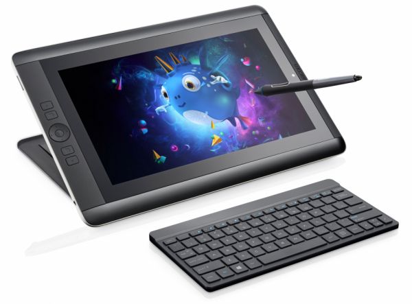 Techno-nerd-wise, this was an interesting month. Our neighbors to the north, Wacom, (in Vancouver, WA), got in touch with me to test their Cintiq Companion for a few weeks and give them feedback/bug reports. At first I thought they'd given me a prototype, but it turns out mine is one of the production models. The fact that it's now my own, my precious, and that it's the same hardware that you, gentle reader, would be purchasing, means the flood gates are open, and I can tell you all about it. How it compares to my faithful Surface Pro, and even a little reference to the new Galaxy Note 10.1 2014 Edition (jeepers, that's a mouthful), which Samsung sent me (thank you). There are a surprising number of people asking for comparisons between the Note and these full-powered PCs, so I'm happy to tell you what I think.
Let's talk Cintiq Companion. When Wacom finally announced it, the first thing people said (as they do) was, "Wah, $2,000+???" Let's look at it this way, and move on: any manufacturer, be they Sony, Microsoft, Fujitsu, etc., charges a premium for a premium spec machine that will not offer drastic real-world performance gains (for most people), over something like the baseline Surface Pro (2), which starts at about a grand. If you load up a comparable Sony machine like the Duo 13 with an i7 CPU and 8GB of RAM, guess where your price point lands? North of 2 grand. And for those who feel they need 8GB of RAM to make their work lives easier (me), just having the option is huge. With the Companion, you're paying dollaz for a pro-spec machine, and one with some serious user-interface advantages for art creation. That's the gist of it.
That leads me into the heart of things; the machine and its interface. Some of what I like:
The build quality is very good. It's heavier than the others I mentioned, but it feels solid in your lap, and the surface area/bevel really works well for its primary purpose as a drawing device. The funny thing about the Note 10.1, by contrast, is that it's lighter and slippery(er), and I really need to set it on something solid for drawing. The Companion stays in place, thanks to rubbery grips, and yes, its almost-four-pound weight.
The surface of the screen also has enough tooth to make drawing a more controlled experience. It's hugely helpful to getting a stroke right the first time. The pen itself is comfortable, and obviously better suited to extended use than the stock Surface or Note 10.1's pen (or the Bamboo Feel I bought for the Surface Pro). Plus, you get additional control with the Companion Pen (buttons, tilt, pressure sensitivity). Tilt, I don't really use (it's often too processor-intensive for my canvas sizes... lag city), but the extra button and the pressure sensitivity are definitely helpful.
Other things that add up: Battery life is surprisingly good (6-7 hours for twiddling your internet thumbs, about 4 for drawing/working). Two USB 3.0 ports instead of the usual one. The optional bluetooth keyboard has great key action (much more accurate/comfortable typing experience vs Surface Pro), is quite low-profile, and it's USB rechargeable (nice). I've actually spent more time writing script for my next book on the Companion than doing anything else (SUE ME), and I've really enjoyed the little keyboard. The Companion's included tote bag is also very nice (look for it hidden in the packaging, I missed it the first time).
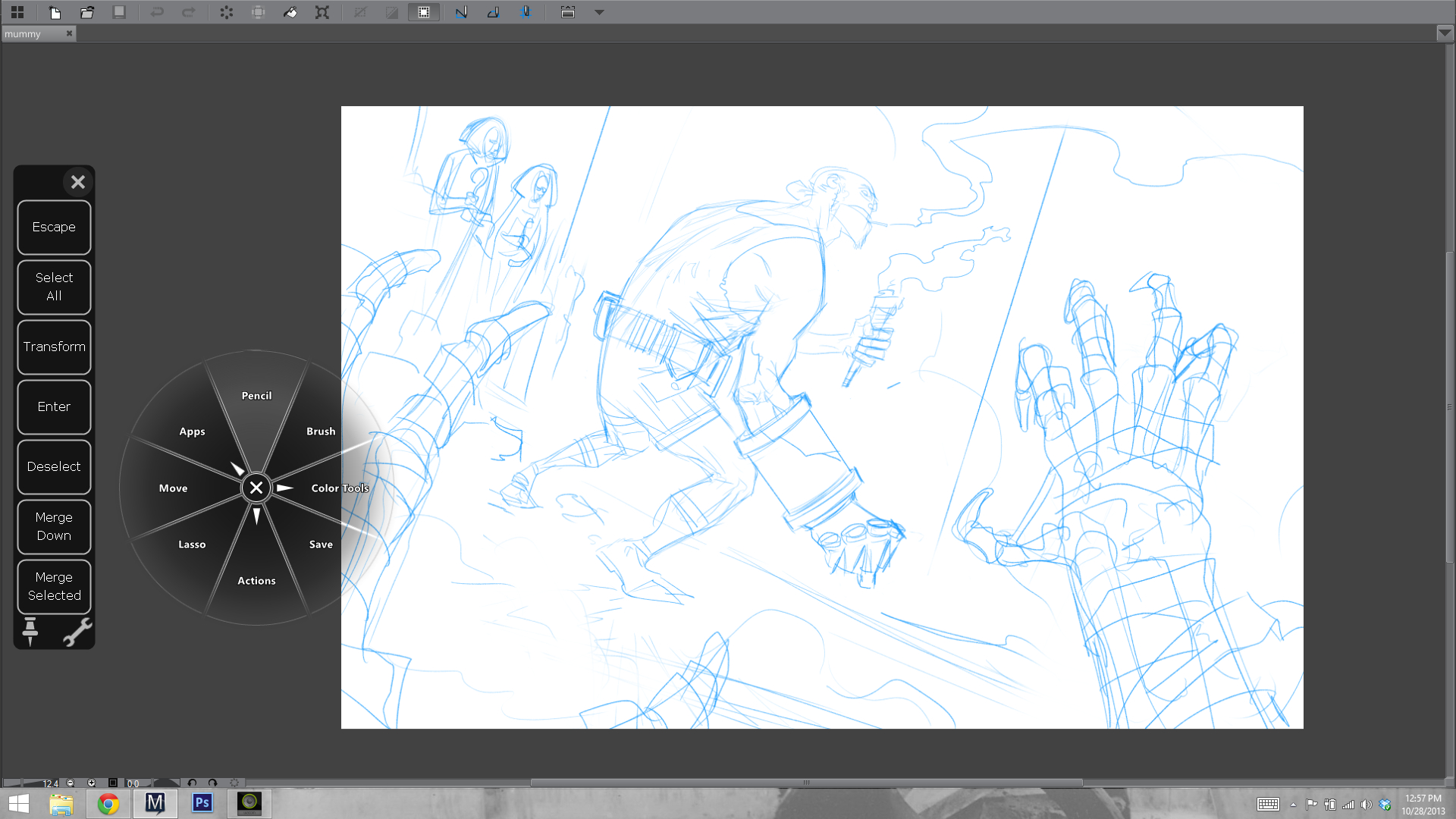
The physical buttons on the bevel and pen go a long way to getting work done efficiently minus a keyboard. For pro applications like Manga Studio and Photoshop, that's a big consideration for those who want real mobility with a device like this. I previously never strayed much from keyboard shortcuts, even with my old Cintiq 21", but because I lacked a keyboard for a while with the Companion, I took time to configure everything and learn what I could do with Wacom's buttons, Radial Menu, and software touch-strips. I came away impressed, and happily efficient in my workflow. That's something you can't do as well with the Surface Pro, the Sony Duo, or the Note. Yes, I made that lovely lap-board to support the Surface's keyboard (wistful sigh), but then its overall weight and footprint is as much or better than the Companion's. I still like my homegrown solution, but the fact is that Wacom designed their Companion with art creation in mind, and the others really did not. There's an appreciable difference in both the feel of getting work done, and in the speed of getting work done when you're on the go, without your keyboard.
The screen is very good. 13 inches is a good compromise for portability/usability, and its resolution is just as sharp as you'd want it to be for graphical interface use (something of a struggle on the Surface Pro). A quick side note: Manga Studio's latest iteration (5.03- free update for people who own 5.0+) has a scalable tablet-friendly interface option that's worth checking out). Colors on the Companion are more accurate than my Surface Pro (not sure about the Pro 2, I know they've made big improvements in their color fidelity).
Those are a lot of the good things, and they make the Companion a great solution for my needs. That said, I've been testing this thing for a month, and I have a clear sense of its faults, some of which may be fixed with software updates. Bear that in mind as you journey with me, into the realm of Nit Picks.
Things I don't like:
The stand functions well for what it is, but what it is is hardly mobile, or very well designed. It seems to me that in V2, Wacom could easily incorporate a multi-stage stand into the device itself without adding much weight, and still retaining the rigidity and strength needed to rest your arm weight on the thing and have it stay put. It's a design challenge, but not an insurmountable one, especially as the computer components themselves shrink with future generations.

Another weird bit is the power button. It's placed right where I touch the device to shift it in my lap, and because of the button's design, it's easily depressed, putting the Companion to sleep (by default- you can change it in the Power Button options in Windows 8, but your shouldn't have to). There's a handy spring-button on the other side of the Companion for locking screen orientation. Making the power button something more like this would solve the problem. It's a weird oversight.
Also annoying is the inability to use this machine as a drawing display for a different computer (ie, a much more powerful workstation). Wacom EU's FAQ on the device says it's a limitation of Windows hardware, lack of interest from consumers, yadda and yadda. I really think this could, and should be done. It's not even about being able to use the device when its hardware is out of date, it's about using the device right now for applications that need more power than it can muster with its own internals. This uses a ULV processor, of the same ilk as the Surface Pro. The i7 vs i5 means you'll see maybe 10% additional horsepower. That's not as much as some people may be expecting. These machines are plenty fast for most illustration purposes, but just as I run into limitations on the Surface Pro, I run into similar limits with the Companion. They both comfortably process 11x17 600 dpi color files with a good number of layers. Double the canvas size, though, as I need to for Batman '66's digital edition, and things bog down. Again, that's a fairly small fraction of my work, but it's an important one. I'd like to either have a full-voltage chip inside this thing, and/or the option to hook it up to a much more powerful PC when I need to cut through a jungle of giant art files. Quick note: If you find brush strokes lagging on the Companion, make sure you have its power mode set to 'High Performance', not 'Balanced'. Click the battery icon and select 'More Power Options' to find it.
Finally, there are a few quirks with drivers and software that could be improved. Touch and gesture support is the least configurable of the Companion's typically robust control-set. It's also the most finicky. Bringing up the software keyboard, for example, often de-registers the cursor in a text field, forcing me to bring up the keyboard, then tap the text field again to start entering text. A small annoyance, but it's there until they fix it in future drivers.
Driver and software issues may not happen to everyone in the same measure they happened to me, but they're part and parcel of a first-gen device like this (and, let's face it, most Windows devices), so you should approach a purchase knowing you may need to sort through a few more software woes than you would with something like the Surface Pro, which comes straight from Microsoft (still, that machine isn't perfect either).
---------------------------------
So there you have it: the good, and the not-so-good. In the end, I feel the good of this machine far outweighs its faults, and I'm very happy with it. My wife now has the Surface Pro, and I'm forging ahead with my digital art creation using the Companion. It feels good, it functions well, and it's by and large a thoughtfully designed art tool. It has plenty of room to improve, but so do the other options. If you're a professional, the Surface Pro 2 with 8GB of RAM is a compelling option, but one lacking the interface and form factor considerations of this machine. With the Surface, you really have to get the keyboard and find a way to use it on a flat surface, whereas the Companion can function pretty well without one (for art). Comparing them that way, you're looking at saving about 500 bucks if you go the Surface route, barring warranty and some extras (these mostly in Wacom's favor). To me, the Companion is worth it. If you're like me, and your file sizes are too large to make the cloud a viable means of working in the studio and at home on multiple devices, the Companion may be a very good solution for keeping everything with you, anytime and anywhere you need to work.

Then there's this little guy. Isn't he darling? That lovely screen, that lightness. It's a nice tablet.
The Note 10.1 is less money yet than the Surface and Companion, and also less useful in its capacity for getting work done, or drawing something easily/accurately. It's a totally different piece of hardware, nice for media consumption and a doodle/rough, but in no way capable of being your only computer/digital art device. Drawing on it is a bit laggy and inaccurate; I was surprised given its specs, but my Galaxy Note 2 phone actually draws and navigates with less lag. Weird.
If you have questions about the hardware I'm reviewing (and I know you do, based on my Surface Pro review), I'm glad to help. Google probably knows better than I do (and is faster at responding), but I'll do what I can.
Til next time!

 Here are two more pieces from this spring's 'Best of the City' article in